Case Study: Duck Creek Technologies
Introduction
Duck Creek Technologies provides an integrated suite of cloud-based software solutions designed for the property and casualty (P&C) insurance sector. The company’s modular platform includes key systems for policy administration, billing, claims management, and rating. Duck Creek’s products are crafted to empower insurers with the tools to optimize their operations, adapt to evolving customer needs, and rapidly bring new offerings to market.
The design process behind Duck Creek’s products demonstrates a clear focus on usability, performance, and customer-centric functionality, highlighting a model approach to user experience and scalable design in enterprise software.

Challenge
Our team’s use of multiple design tools—Sketch, Axure RP, and OmniGraffle—presented major challenges to collaboration and design consistency. The flexibility allowed each designer to work in their comfort zone, but as projects moved between designers or new priorities emerged, the lack of a centralized design system library hindered efficiency. Without a shared library of reusable components, we found ourselves frequently recreating patterns across tools, resulting in inconsistent designs and a labor-intensive process to track updates. This fragmentation ultimately slowed us down and made it difficult to deliver a consistent and seamless product experience.
Goals for Migration
Our objectives for transitioning to Figma included:
- Unify Tools and Processes: Standardize on Figma to streamline collaboration, reduce costs, and build cohesive team expertise.
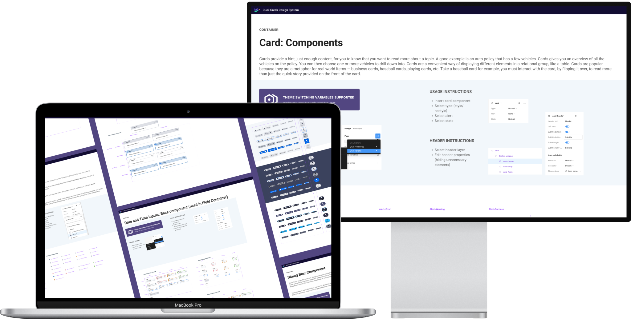
- Centralize a Design System Library: Build a comprehensive library of reusable components that aligns with Duck Creek’s design standards and is accessible across teams.
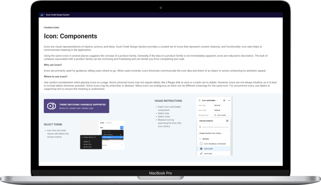
- Embed Clear Documentation: Incorporate instructions and configuration guidance within each component to support consistent usage and adaptability.
- Encourage Continuous Learning: Establish resources, feedback channels, and training to adapt to Figma’s evolving feature set and enhance team proficiency.
Approach to Planning
The migration began with agile planning, using Duck Creek’s two-week sprint cycles. Collaborating with our DesignOps Manager and Design System Product Owner, we set up a phased roadmap, identified dependencies and risks, and created a backlog of prioritized components. Using atomic design principles (a-la Brad Frost), we structured the library in a way that allowed us to build from basic atoms to more complex organisms.

Image courtesy of Brad Frost. Read more about Atomic Design .
The Pivot: Figma's Variables and Modes
Early in our work, Figma announced the beta release of variables and modes at Config 2023. This shift was pivotal, as it introduced new ways to handle multi-theme designs across Duck Creek’s product lines. Initially, our library focused on the Worker theme, but with variables and modes, we could expand to include additional themes without duplicating components.
Seeing the potential impact, we paused development temporarily and dedicated a design sprint as a “spike” to explore these features. The outcome was game-changing: we implemented Figma variables for a streamlined, scalable approach to theme management, ultimately saving time and future maintenance efforts. The early pivot allowed us to future-proof our library, and we resumed component development with minimal rework.
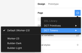
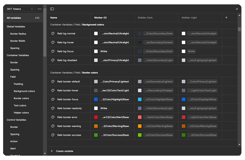
Figma variables empowered us to tokenize styles within the Design System to support multiple Duck Creek themes.
Execution and Ongoing Collaboration
Our sprints included weekly critiques, where we presented in-progress work to gather real-time feedback. We also established bi-weekly “Figma Office Hours,” providing onboarding, library updates, and a platform for feedback. By standardizing layer naming and structuring components with variants, we streamlined the library setup, ensuring it could scale across multiple product lines.
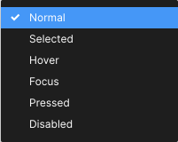
The Design System library was designed for accessibility in mind, accounting for all of the various interactive states for its components and patterns.
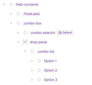
Layers within library components and patterns were named with consistency in mind.
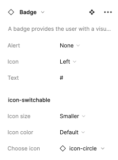
Library components were architected to make configuring the properties very easy for the most common use cases.
Results and Lessons Learned
The Figma migration produced substantial results:
- Improved Design Efficiency: With a structured library and standardized components, we reduced the need for repetitive design work, shortening timelines and enhancing cross-team efficiency.
- Scalability and Consistency: Centralizing our library ensured a consistent user experience across products, enhancing the brand’s overall presentation.
- Future-Proofing the Library: Integrating Figma’s variables and modes enabled the library to accommodate new themes and product updates easily.
Final Thoughts
By pivoting our approach to leverage Figma’s new features, Duck Creek’s design team created a design system library that’s not only efficient and consistent but also adaptable to future needs. This strategic adaptation sets a strong foundation for continuous improvement, ensuring that Duck Creek can deliver innovative, user-centered products well into the future.
